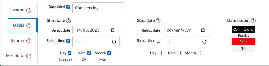
Dates tab - module configuration element
Background
The dates tab is one of four tabs that form the module configuration area. It provides the interface to configure various date related properties to define a single date (just the start date) or a date range (from start date to stop date) for each module. Different
Properties
As shown above the dates tab consists of four main components summarised in the following table.
| Components | Description |
|---|---|
| Date label | A text label that will be added before the date (range). e.g. "Starts" or "Due". |
| Start Date | A collection of properties that can be used to specify a date or the start of a date range. |
| Stop Date | A collection of properties that can be used to specify the end of a date range. |
| Date output | A human readable description of the current date. Using the date representation from the GriffithCards representation. |
Date label
The date label is intended as a short text label that will normally precede the rest of the date. For example, the image above is using Commencing as the date label.
No HTML in the date label
HTML tags included in the date label will appears as text. Will note change the appearance.
Start and stop date
The Start and Stop dates are used to define the time and date components. There are three common combinations of start and stop dates:
- Neither start nor stop dates defined - no date appears in any representation.
- Just the start date is defined - a single date appears.
- Both start and stop dates defined - a date range appears.
The date/time properties available for both start and stop dates are summarised in the following table. Only two of these properties can be selected by you.
| Property | Description |
|---|---|
| Select date | Used to select which calendar date applies for this date |
| Select Time | (optionally) select the time of date for the date |
| Day | Automatically calculated based on the selected calendar date. Provided to enable inclusion in the date output |
| Date | Automatically calculated based on the selected calendar date. Provided to enable inclusion in the date output |
| Month | Automatically calculated based on the selected calendar date. Provided to enable inclusion in the date output |
Visibility
For a selected date, each of the following components can be hidden by turning off the related visibility checkbox.
| Property | Description |
|---|---|
| Time | Whether or not the time is shown |
| Day | Whether the day of the week for the chosen date is shown |
| Date | Whether the numeric date of the month for the chosen date is shown |
| Month | Whether the abbreviated month name for the chosen date is shown |
Date output
The final component of the dates tab is the date output. It provides a representation of the module's configured date/time (range) using the GriffithCards date representation. Provided to give immediate feedback on the current date configuration.
Examples
Navigate
What visitors to a course site see in terms of dates depends on a combination of:
- how they data properties have been configured; and
- what representation is being used.
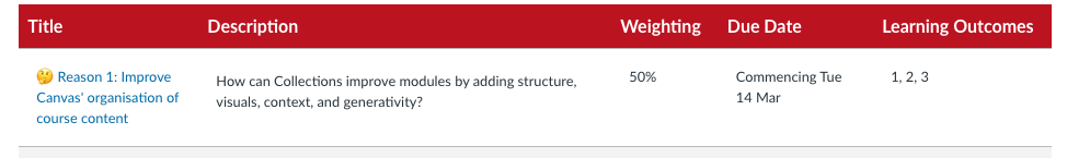
For example, the following two figures demonstrate the appearance of the date configuration in the figure at the top of this page using the two most common representations.
GriffithCards representation
The GriffithCards representation uses a very "card" specific representation of dates. But one that is broadly task independent.

AssessmentTable representation
The AssessmentTable representation is designed for a more specific and less visual purpose.
Configure
The following animated image shows how to use the date tab and the different ways dates can be displayed.