Banner
Banner tab - the module configuration area
The banner tab is one of four tabs that form the module configuration area. It provides the interface to configure a banner (image, iframe, or colour) associated with a specific module (see below).
The banner option only applies to one (some) representations
How an object is represented is the responsibility of the chosen representation. Currently, only the Griffith Cards representation uses the banner options.
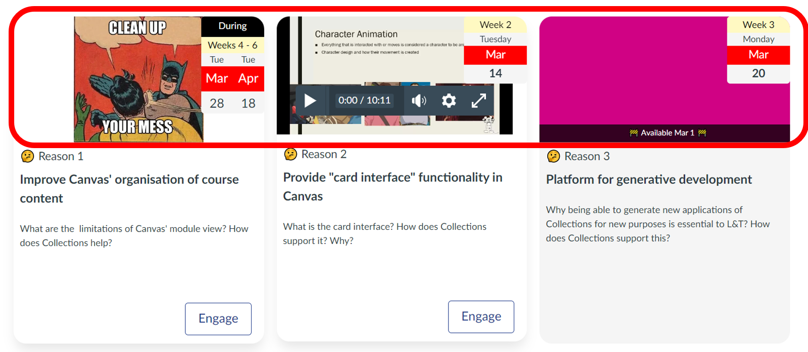
Collection's cards representation uses the idea of a banner as the top section of the card (circled in red in the following image). It is used provide an additional visual representation of the module with the intent to enhance
- the visual design of the course; and,
- student learning (see dual-coding theory).
Three types of banner
As illustrated in the image above, there are three common types of banner:
-
Image - the URL of an image is provided and is displayed in the banner.
The first image above uses an image to reinforce the primary purpose of Collections.
-
Iframe - a HTML iframe element used to embed another web page
The second card above shows an embedded Canvas Studio video.
-
Colour - the banner background is set to a single colour.
The last card above has a plain colour background.
Choosing the banner type
The Collections' module configuration area includes a banner tab. This allows you to
- Choose the type of banner to use; and,
- Configure the chosen banner.
The following animated image demonstrates where to find the banner tab and how which ever banner option you've chosen last, is the option used by the representation.
Configuring the chosen banner type
Image
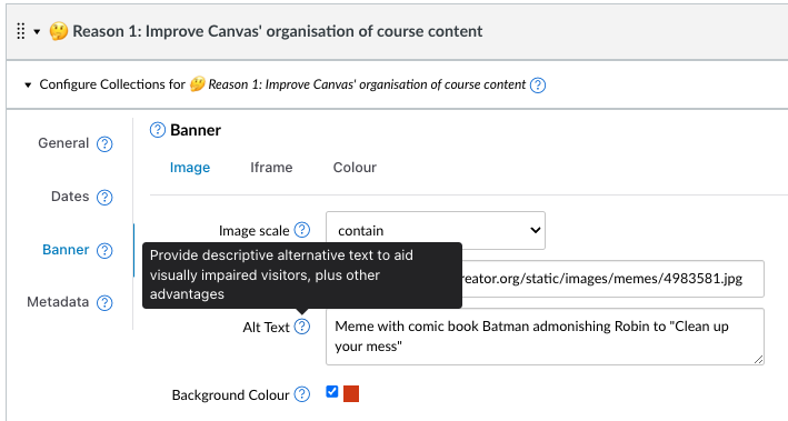
Images are specified by two pieces of metadata:
- Image url - the web location where the image can be viewed.
- Image scale - how the image should be scaled to fit within the available space.
Image url
Specifies the location (Universal Resource Locator - URL) for an image to display in the banner. The URL can be to an image stored in Canvas files, or to an image stored on another web site. The only constraint is that all visitors to the course site are able to access the image.
Using an image in your course's files area
Rather than rely on external images, you can use an image in your course's files area by generating a URL.
Note: The Canvas Collections course copy process will update these URLs if you copy content to a new Canvas course site.
Use of the placeholder image
If the image banner type is chosen and no image url is specified, a placeholder image is used.
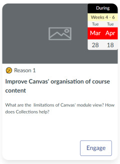
Image scale
It is likely that your chosen image does not have the same aspect ratio as the banner section of the card. This is especially true given that the size of the banner section is not fixed. It is responsive to the size of the browser window and the configuration of the Cards representation.
Image scale is used to inform the browser how to scale your image to fit the available space. Image scale modifies the scaling of the image using the standard CSS property called object-fit. The following table outlines the possible values for object-fit. These values appear in the Image scale drop down when configuring a module.
| Value | Description |
|---|---|
| cover | The image is scaled to fit the available space, maintaining the aspect ratio. The image is cropped to fit the available space. |
| contain | The image is scaled to fit the available space, maintaining the aspect ratio. The image is not cropped. |
| fill | The image is scaled to fill the available space, maintaining the aspect ratio. The image is cropped to fit the available space. |
| fit | The image is scaled to fit the available space, maintaining the aspect ratio. The image is not cropped. |
| none | The image is not scaled. |
| scale-down | The image is scaled to fit the available space, maintaining the aspect ratio. The image is not cropped. |
Image Alt(ernative) Text
Every image on a website - including banner images - should have an alternative text description. "Alt text" serves a number of purposes, including being used by screen readers.
For more background on the importance of alt text and how to write good alt text, see this article
Only text is allowed in the alt text field
The alt text field does not allow you to use HTML. Any HTML will be removed.
(Image) Background Colour
When using an image banner it can be useful to change the background of the banner from the default white. If selected, the Background Colour option will use the colour specified by the Colour feature (see below) as the colour in the background of your image.
Iframe
The iframe banner type allows you to embed another web page into the banner section using the HTML iframe element. Most useful for embedding video (e.g. from YouTube or Studio).
Collections will check and modify the iframe code
Collections will perform some checks on the iframe code, including attempting to ensure the iframe will fit within the banner section.
You will be given a choice to check the modifications before proceeding.
Colour
The colour banner type enables the use of a fixed colour for the banner. Useful in situations where a module represents a topic/purposes for which no photo or video is available or suitable. The colour is chosen using a colour component that allows you to specify the colour in numerous different ways.