Developing a new representation
An example of one process for developing a new representation. Illustrated using the development of the HorizontalCards representation as an example. Steps summarised in the following table and expanded below.
Once finished your representation, you may want to consider contributing it back to the Collections community
| Step | Description |
|---|---|
| 1. Design the representation | Have some idea of the aim and what it will look like using standard HTML design tools. Don't go anywhere near Collections to start. |
| 2. Test in the RCE | Especially if you wish to implement a Claytons version, which is restricted to the list of HTML/CSS allowed by the Canvas RCE. |
| 3. Add the skeleton representation component | Modify and re-build the Collections source code to have a version of your representation that doesn't yet do anything. |
| 4. Refine it | Step through the process of turning the skeleton component into something functional |
| 5. Add the Claytons version | Modify the original work to provide the option of a purpose designed Claytons version |
| 6. Test it | The on-going process to test and refine your representation |
maybe give overview of the steps, in a table??
1. Design the representation
Why? Inspiration?
There are situation where "live" Collections cannot be installed nor can any external CSS. Meaning course design is limited by the Canvas RCE.
The HorizontalCard representation aims to provide a visual (not tabular) representation that can easily used with Claytons collections. That is, static HTML that can work in the Canvas RCE without requiring any external CSS files.
Within that constraint the aim is that a single collection's modules can be represented using a vertical sequence of horizontal "cards", each card containing some/all of
- a banner image/iframe
- a header with module name
- the module label/number displayed appropriately
- module dates displayed visually
- the module description
Design
If you're lucky you are (have access to) a designer. Saving that borrow inspiration from wherever you can find it. i.e. the approach used here.
Here's the initial set of designs of the HorizontalCard representation. Given the aim to be Claytons friendly, the initial designs have focused on that and hence don't take full advantage of some CSS capabilities. The grid format appears somewhat problematic. Hence starting with the first example.
2. Test in the RCE
Given the RCE only allows some HTML/CSS a manual test is required. As shown below box-shadow is not one of the allowed style properties, hence no nice drop shadow when shown in the RCE.
3. Add the skeleton representation component
With a basic design, time to add the representation. There are three steps.
3.1 Decide on a name
In this case, we're going with HorizontalCards.
3.2 Create an initial representation file
Each representation is implemented by a single Svelte component stored in the src/components/Representations folder in the Collections source code.
The simplest way to create the initial Svelte component for your representation is to copy and paste the CollectionsOnly.svelte file. CollectionsOnly implements the bare bones minimal for a representation.
Be sure the filename of the copy matches your representation's name e.g. HorizontalCards.svelte
3.3. Update the new representation component
You may wish to modify the copyright notice and other minor changes.
There is also a commented out "hello world" heading. Uncommenting this can be a useful early indicator that your new representation is operational.
3.3 "Register" the representation
For your new representation to be usable in Collections, it needs to be registered. This is done by editing the src/stores.ts file in the Collections repository.
There are two changes to be made:
-
Import the newly created representation svelte file
-
Add an entry to the
representationStorestore
3.4 Test if it's working
If you make the above changes and re-build your local version of Collections you should then be able to add a new
4. Refine it
And now the real work begins. Adding in the HTML from your design and replace hard-coded values with Svelte statements that Collections can use.
4.1 Add your existing HTML
For HorizontalCards I copy and pasted the appropriate code from the design options into the new Svelte component just under the hello world. To test it, I modified one of the collections from my sample course to use the new representation.
Tweak the HTML correctly and the following hard-coded HTML gets presented.
4.2 Add the module loop
The remaining works involves modifying the Svelte component for your representation. Replacing hard-coded values with variables that make the representation work with any collection and its modules.
First step is adding a loop around the single module representation. This is done using the Svelte each command and the array modules already created. modules is an array of objects. Each representing one of the modules for the current collection and providing access to all the available information about the module.
For example, the following code generates three versions of the above figure. One for each of the three modules in the collection I'm using for testing.
4.3 Replace the hard-coded values
The next step is to replace the hard-coded values (e.g. for dates, module title etc) with information about the specific modules. There are two broad ways of doing this, using:
- variables; or,
- other Svelte components.
Looking at other representation components (e.g. GriffithCards) may help.
Variables
Collections maintains two data structures that provide access to Canvas and Collections information about each module.
theModulevariable is "Collections Canvas module" object and provides some basic information from Canvas about a specific module. In particular, the module id.-
The module id can be used to access the
$collectionStoreand the information Collections stores about each module.The "Collections module object" section of the data structures page provides more detail about the variables that are available.
The following table provides a mapping between the hard-coded values in the existing design of HorizontalCards and how to relevant Collections variables (or functions). Examine the GriffithCards (or other) representations to see examples.
The task now is to replace the hard-coded values in the representation component with the appropriate Svelte variable statements. Once done, we get the figure below.
| Value required | Existing value | Svelte variable |
|---|---|---|
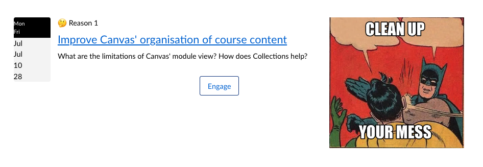
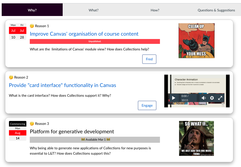
| Label and number | 🤔 Reason 1 | $collectionsStore["MODULES"][theModule.id].label and $collectionsStore["MODULES"][theModuleId].actualNum] |
| Module name | Improve Canvas' organisation of course content | theModule.name |
| Module name (de-labeled) | Improve Canvas' organisation of course content | deLabelModuleName( $collectionsStore["MODULES"][theModule.id])} |
| Module description | What are the limitations of Canvas' module view? How does Collections help? | $collectionsStore["MODULES"][theModule.id].description |
| Link to Module | http://canvas.docker/courses/1/modules#module_1 | the `getModuleUrl function |
A "de-labeled" module name will not include the module's label and number. Useful for improving the visual display.
Other Svelte components and complexities
Some of the features used by representations are more complex than simple variables. The functions introduced above (getModuleUrl and deLabelModuleName) are simple examples. More complex examples include: use of other Svelte components; or more complex Svelte statements in the representation.
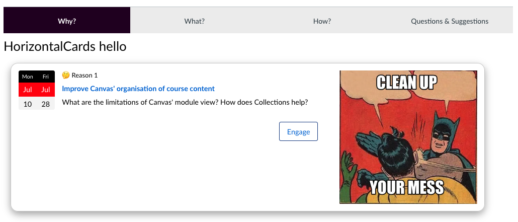
The following table summarises the additional complexities required by HorizontalCards and one by an existing Collections feature (FYI modules). Due to its design it borrows heavily from the GriffithCards representation. With a different representation you may be creating your own components.
Yep, it gets a bit complicated here. But we end up with the figure below.
| Value required | Existing Value | Additional complexity |
|---|---|---|
| Module date | A dual date from July 10 to 28 | DateWidget component |
| Banner (image) | Batman/Robin meme image | A group of three related banner components |
| Engage button | Button visible with Engage |
More complex conditional Svelte statements to show (or not) the button as configured |
| FYI objects | n/a | If a module is an FYI object, display a message and don't link to it |
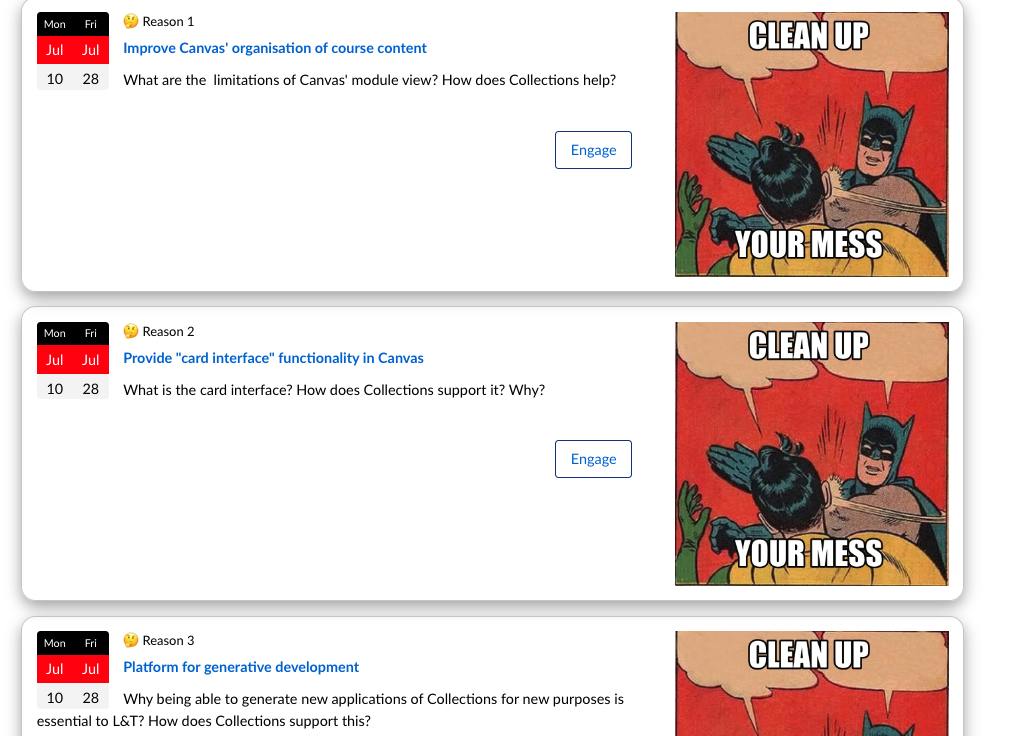
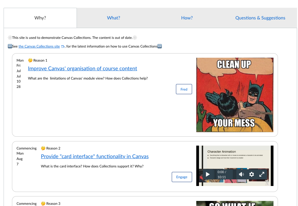
The following figure demonstrates the following "complications" completed:
- When viewed by a teacher, any unpublished module is labelled unpublished (invisible to students).
- Banners can include images or iframes.
- If not date is configured, the date widget is empty.
- FYI cards get messages and no link to the module (for students an FYI module will normally be invisible/unpublished)
5. Add the Claytons version
Representations are generally expected to support the Claytons mode of Collections. The ability to update a Canvas page with a static representation of one or more collections. A static representation that plays nicely with the Canvas RCE. Either by relying on external CSS or limiting itself to the HTML/CSS supported by the RCE.
Supporting Claytons does require some additional work from people writing representations. In summary, the work involves creating another collection of HTML/Svelte commands grouped under a {if claytons} statement.
Depending on the design of your representation you may not need a Claytons Version. A simple way to check is to
- Create a Claytons version using your representation.
- Ensure you turn off the Collections code and CSS (these provide some CSS and thus don't provide a good test.)
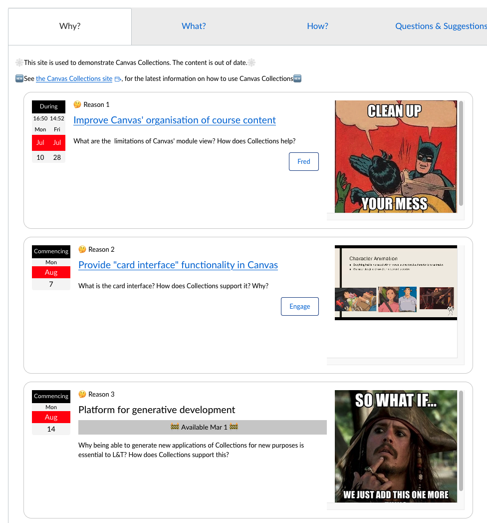
The following demonstrates the current state of the Claytons version of HorizontalCards. Visible problems appear to be
- The engage buttons placement is off.
- The FYI banner message has lost its styling.
-
The dates have no CSS applied.
Due to the dates being implemented using the
DateWidget. Which currently does not actively support Claytons. - The banners height is not consistent.This is due to the banner's relying on the
object-fitCSS property, which is not supported by the RCE.
To address these is likely to require work on a distinctly different collection of HTML than the live representation. Hence the first step is often to...
5.1 Create the {if ! claytons}...{:else}...{/if}
The boolean claytons variable is available in every representation. If true the user has requested a Claytons version. One way to provide this is to have a separate collection of HTML/Svelte specifically for Claytons.
This can be started by creating the above Svelte if structure. If claytons is false then the live existing HTML/CSS is used. If it is true, then the newly developed claytons HTML/CSS is used.
5.2 Make the necessary changes
The changes necessary for HorizontalCards includes
- Additional inline styling for the FYI card notice.
- Engage button placement left alone as no good, quick solution obvious.
- Update the date component to support Claytons
- Add a fixed height to each card
Giving the figure below.
Juice CSS Inline is helpful
The main requirement for Claytons is generating inline CSS. The Juice CSS Inline tool has been helpful.
6. Test it
There are quite a few moving parts. First with the representation and Collections itself, but even more so with the wide variety of considerations for a representation (e.g. accessibility, responsive design etc.)